October in Vancouver means one thing: it gets dark, it gets wet, and motivation to get outside takes a hit. So when we partnered with On Running to host a shoe demo night, we decided to build a whole event around shaking off that gloom. The result was It's Not a Race, an unsanctioned street race with absolutely no winners. Participants picked up a map with clues leading to checkpoints around the neighbourhood, choosing between a short, medium, or long route. There was no finish line in the usual sense, just prizes for the most unexpected things. Everyone started and ended back at the store, where the night wrapped up with food, drinks, and a DJ.
Project Type
Brand Partner Campaign
Project Role
Campaign Strategy, Creative Direction, Environmental Design, Graphic Design, Content Creation

The Brand
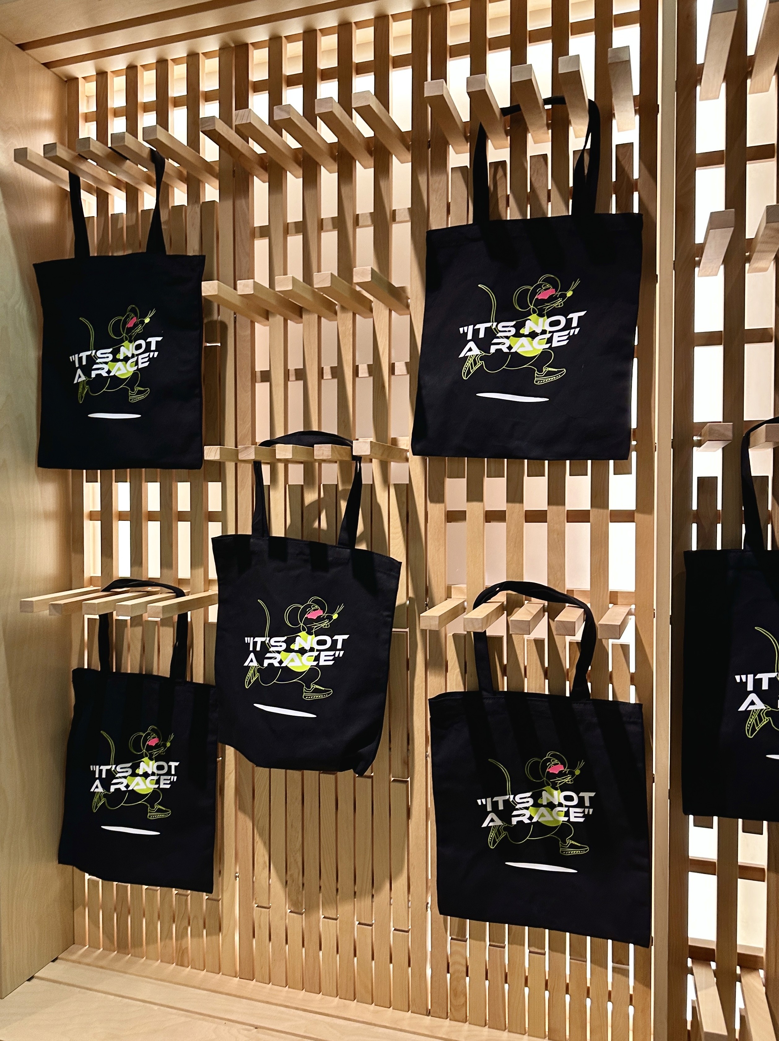
The whole identity grew out of the idea of an unsanctioned race. We started with the kit, since every real race sends you home with a tee, a bib and a bag, even though this one had no finish line. From there, we thought about what the event itself should feel, and built the branding around that. Loud, colourful, breaking rules, in the true unsanctioned race spirit.
Leading the design and creative strategy gave me the freedom to have fun with it. Cheeky social posts, garage photoshoots, a guerrilla marketing feel that ran through everything. Working with a friend on the illustration, we developed a mascot for the campaign, a rat in running shoes and sunglasses, and built the rest of the system around it: neon green, neon pink, and black.



A Small Detail
One of my favourite parts of this whole project is something most people would never notice. On the back of the tote, the RunAsYouAre logo runs vertically rather than the usual horizontal lock-up.
We had used a horizontal logo on totes before, but once the bag is actually being worn, it sits flat against your body and gets lost. By turning the logo vertical and angling it outward, it peeks out from behind the wearer's shoulder instead, visible exactly when and where it actually gets seen.
It is a tiny change, but it is the kind of detail that comes from thinking about how something is actually going to be used, not just how it looks in a mockup.


Reflections
The event sold out almost instantly. On the night, participants picked up their kits and set off with their map and checkpoint clues, completing little games and challenges along the way. With no real finish line, the energy stayed loose and playful from start to finish.
What I love about this campaign is that it didn't need to carry the weight of core brand messaging. It gave us room to step outside the usual confines of the brand and create something fun, a little unexpected, and entirely community focused. Those are the moments that build real connection to a store, the ones that turn people into part of a community rather than just customers.
It was also a much scrappier project than some of the bigger budget campaigns I've worked on, but that didn't stop it from being a strong one. We managed to pull off something that had an impact for the community and achieved all our goals.